Evolving Design Strategies: A Journey Through Feedback and Reflection
- Nazlı Doğa Erdoğan
- 9 Şub 2025
- 3 dakikada okunur

Güncelleme tarihi: 6 May 2025
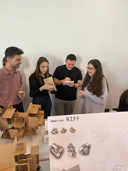
This time, we worked on a project where we used all the concepts we learned throughout the semester together. We designed three different units and formed a group with these three units that had different volumetric properties and relationships. Returning to the forms and materials I was more familiar with made me feel really comfortable, and the process was very enjoyable for me. I believe that using corrugated cardboard makes it easier to control the enclosure quality of spaces and to create hinges and thresholds.


Later, we added linear elements to our groups, allowing us to introduce new characteristics to our volumes. After that, we expanded our organization to include 11 units and 3 groups, which made our strategy even more important. I think following a clear strategy helps to relate volumes to each other and integrate units and groups more effectively. At this stage, my strategy was to surround the central large volume with smaller and more enclosed volumes. Additionally, I connected the three different unit types only within their own axes to establish relationships among them. My model in this form was presented for pre-jury.


During the pre-jury, the professors mentioned that they liked the layout of my poster. However, they pointed out that my model did not fully reflect my strategy. Some parts surrounding the central volume were too narrow, and they suggested that removing them might improve the design. They also mentioned that the purpose of the folds was unclear and that it might be more effective to use them in the upper parts. They acknowledged that some volumes and hinges worked well in their specific areas but didn’t create a strong enough effect throughout the entire model. My strategy was understood since it was very strong and clear, but they still emphasized that it needed further development. They also mentioned that I needed to work on my diagram because, in its current state, it was two-dimensional, whereas I needed to create a three-dimensional diagram. This feedback confused me a lot, but I believe I can improve it.


After the pre-jury, the professors explained the concepts of hinges and thresholds to us and asked us to specifically focus on these aspects in a certain part of our model. In real life, hinges and thresholds are easier to identify in buildings and structures, but creating a threshold in an abstract environment is quite challenging, in my opinion. After working on this concept in one section of my model, I revised the entire model based on the pre-jury feedback while also paying attention to hinges and thresholds.


Following this, the professors mentioned that the references to the central void should also be reflected on the walls and that some parts needed to be opened up. This required me to change my strategy. However, instead of altering my strategy, I decided to create a model that was better aligned with it. I expanded the central void and created a new model using nearly 16 units, then received further critique on this version. At this stage, my strategy evolved into creating a contrast between the large central void and the smaller, denser voids surrounding it. Later, I extended this contrast strategy to the linear elements, ensuring that thick and long elements were contrasted with thin and short ones.


Presenting to the jury was truly exciting. I was incredibly nervous throughout the process. Fortunately, the jury members stated that my model successfully reflected my strategy and that my craftsmanship was excellent. However, they mentioned that the contrast strategy in the linear elements was not effective and suggested that if they fragmented from the central part, they could express the void in a different way. They also pointed out that some volumes were too enclosed and that it was unnecessary to fully cover them; instead, allowing some openness could create a more visually and spatially engaging experience. Organizationally, they suggested that the reflections of the central main volume could be seen in the textured areas or at the points where it connects, and that showing these elements on the exterior of the model could contribute to its overall coherence. This way, it would be possible to visually and relationally express that we are looking at the same thing from different perspectives.
Even though I think the jury went really well, I can’t deny how nervous and tense I felt throughout the process.


Yorumlar